
Branding
Introduction:
Our Engage platforms are built using our default colors and logos. However, users with content manager permissions can customize these branding elements to help create your company’s unique identity and consistency in your organization’s Engage install.
Users with content manager permissions can access the Branding Tab inside Content Management
This tab allows you to manage several branding elements:
Logos
A logo for an organization is the logo you see in the upper left corner when your users login to the Engage platform (as seen in the image above).
This logo will also be seen by your contacts in their live view (as seen in the image below).
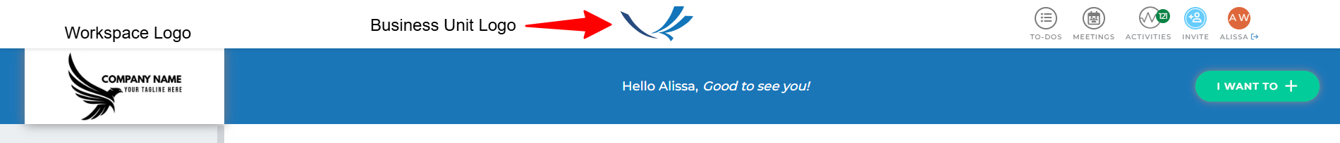
If your organization does not have Business Units configured, the overall company logo (first logo option in your Branding tab) will appear in it’s place.
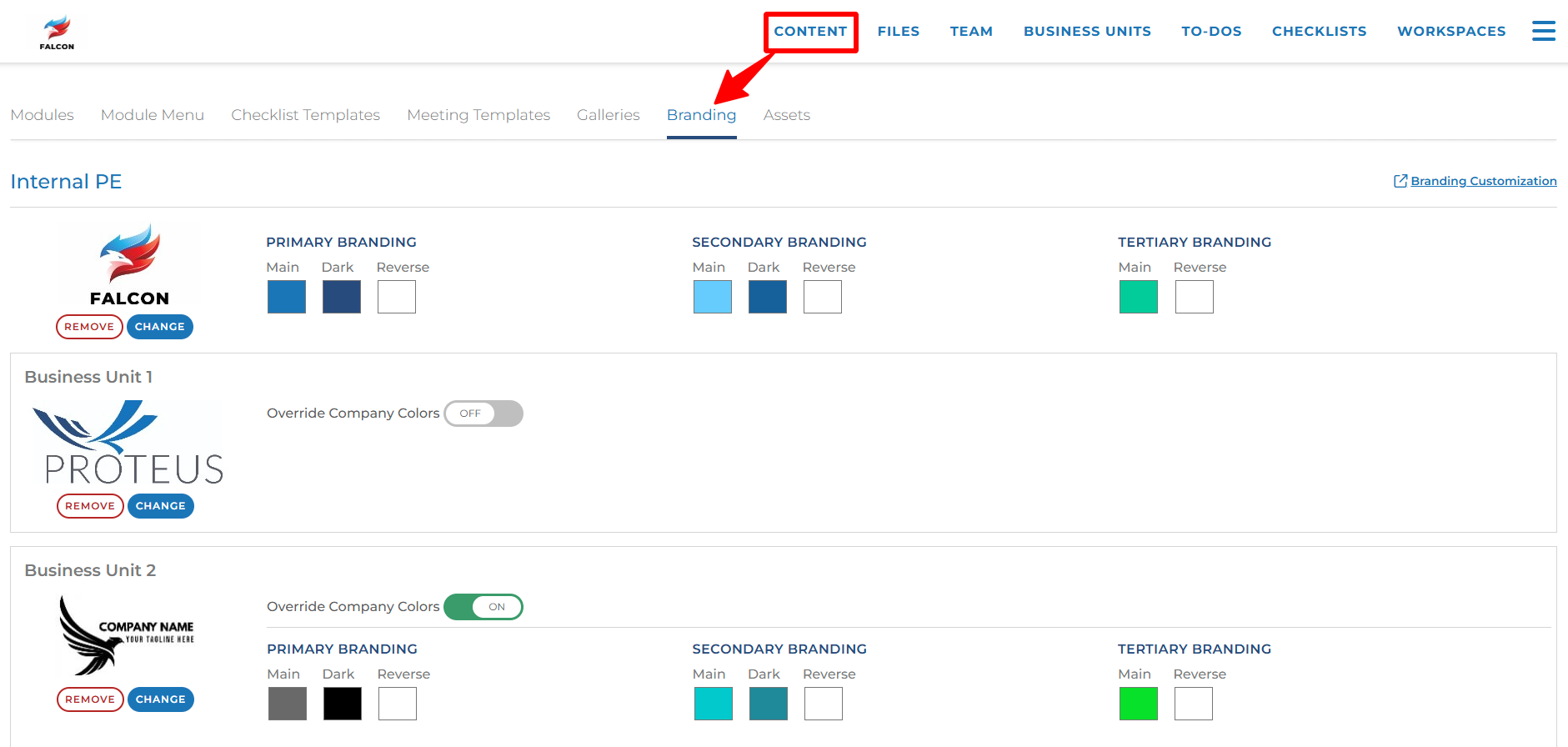
Colors
The Engage platform is delivered using a default color scheme of our own branding colors. But your content managers can add your company’s colors instead.
The top section of colors next to your overall company logo take precedence. Click each color box to open a color picker for that box. You can enter RGB, HSL, or HEX codes. You can also click the eyedropper button to select a color from your screen. You can hover over parts of your logo and click to select that color for that box.
If has Business Units configured, you can choose to use the company colors for each business unit or use different colors for each business unit. Toggle the “Override Company Colors” button on to choose your own colors for the business unit or leave it toggled off to use the company colors.
Where Colors are Used
When adding new modules each design has elements that are defined and mapped to a color rule. There are three primary colors used to customize your Contact Interface: Main, Accent and Tertiary.
These colors are used primarily for visual elements such as backgrounds, headers, and call to action items (links and buttons). These colors can be customized using your organization’s color branding but the usage of these colors must remain within the module configuration rules.
While this guide does not provide all of the module options it will provide a visual representation of the most frequently used elements and the elements that are displayed in the Contact interface.
Primary Element Colors:
Color-brand-main:
This is the color that will be used most often throughout your Engage site.
Where you’ll see it:
Contact View’s banner
Text of the group names, contact names, and rep names within the workspace
Background of any Module buttons and Scheduling button.
Color-brand-main-dark:
This color should be set to a darker version of your “color-brand-main” color.
For example, the heading text for modules is important to be legible against the white background of a module, therefore if a client’s “color-brand-main” color does not read well against a white background, this color will be used in substitute of the “color-brand-main.”
Where you’ll see it:
All module headings
Action buttons (add to-do, add comment, share module)
Color-brand-accent:
This color is used as an accent to several module elements.
Where you’ll see it:
Background of a quote in the welcome and/or bio modules.
Numbers within a stat strip asset type
The option for the contact to add a new document to a document sharing module (the box fill color).
Document type symbols within the document sharing module
Color-brand-tertiary:
This color is only used in 3 places within an Engage site. Usually to call out items that are small in size, but used in big ways by the contact. We want these elements to be easily noticeable among all the other colors.
Where you’ll see it:
The “I want to” button on the contact’s view
Text at comment text at the bottom of every module that notifies you of a comment or (if it’s blank) will say “Respond to {primary rep} and team here”
Sample: Views with Color Identifiers
Key:
Color-brand-main, Color-brand-main-dark, Color-brand-accent, Color-brand-tertiary
Workspace Edit View
Private Group
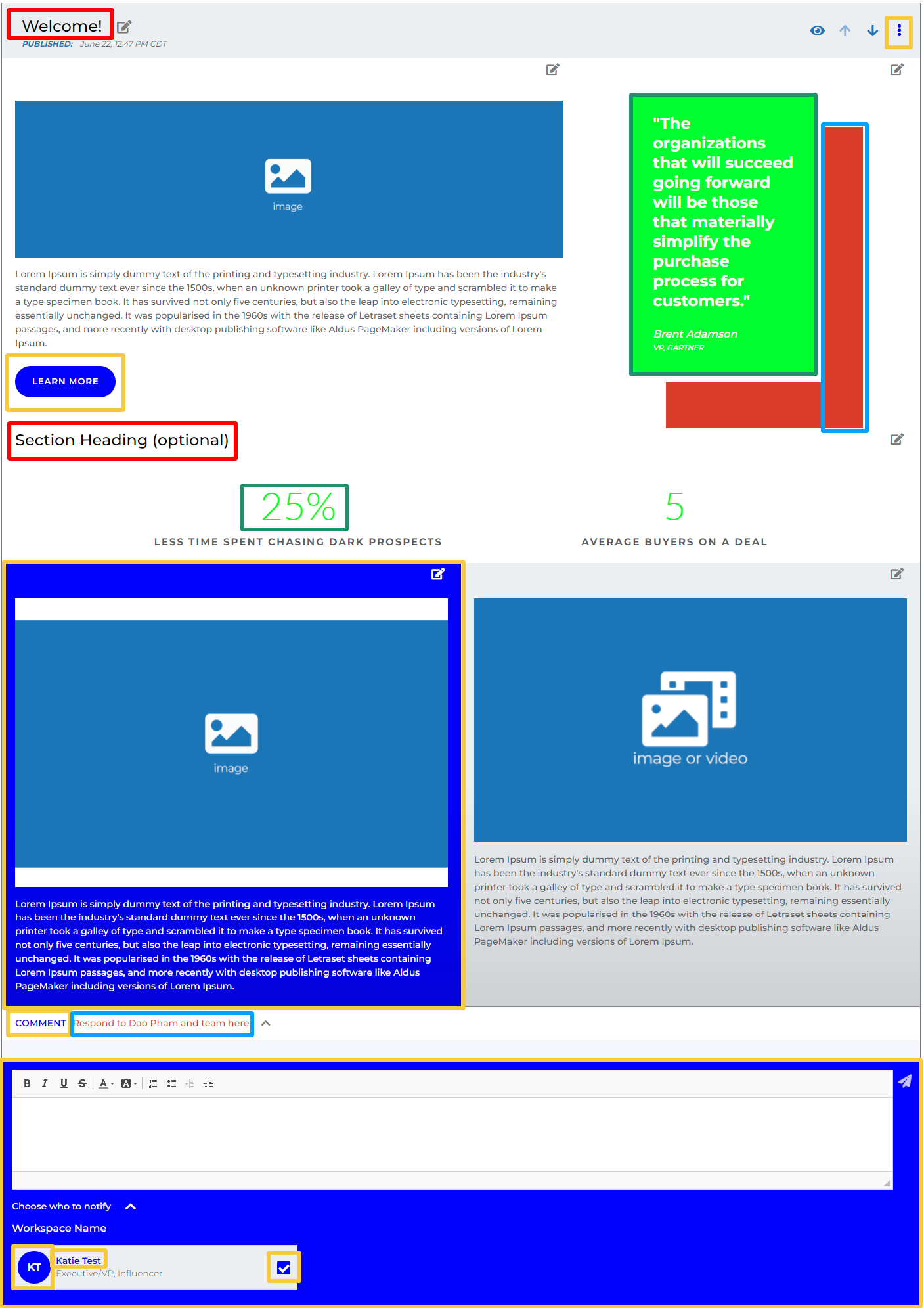
Templated Welcome Module