
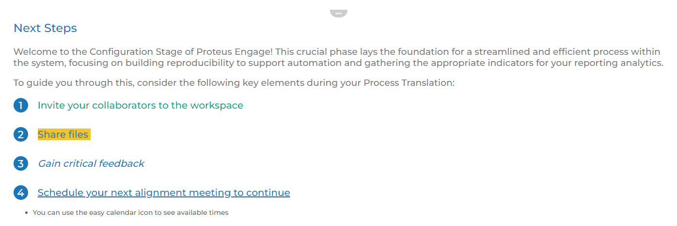
Components
Components are what we call the pieces of content that make up a module. A module can contain one or a combination of different components. These components have different configurations that allow for different pieces of content to be displayed.
A component is usually indicated by the horizontal ellipse icon “ ” at the top of a section within a module. This button gives users access to the content, configuration, and permission settings for the component.
In this article, we will provide you insight on our most popular component types, how they are used, and what a powerful source of content they can be on your workspace.
Types of Components:
Banner
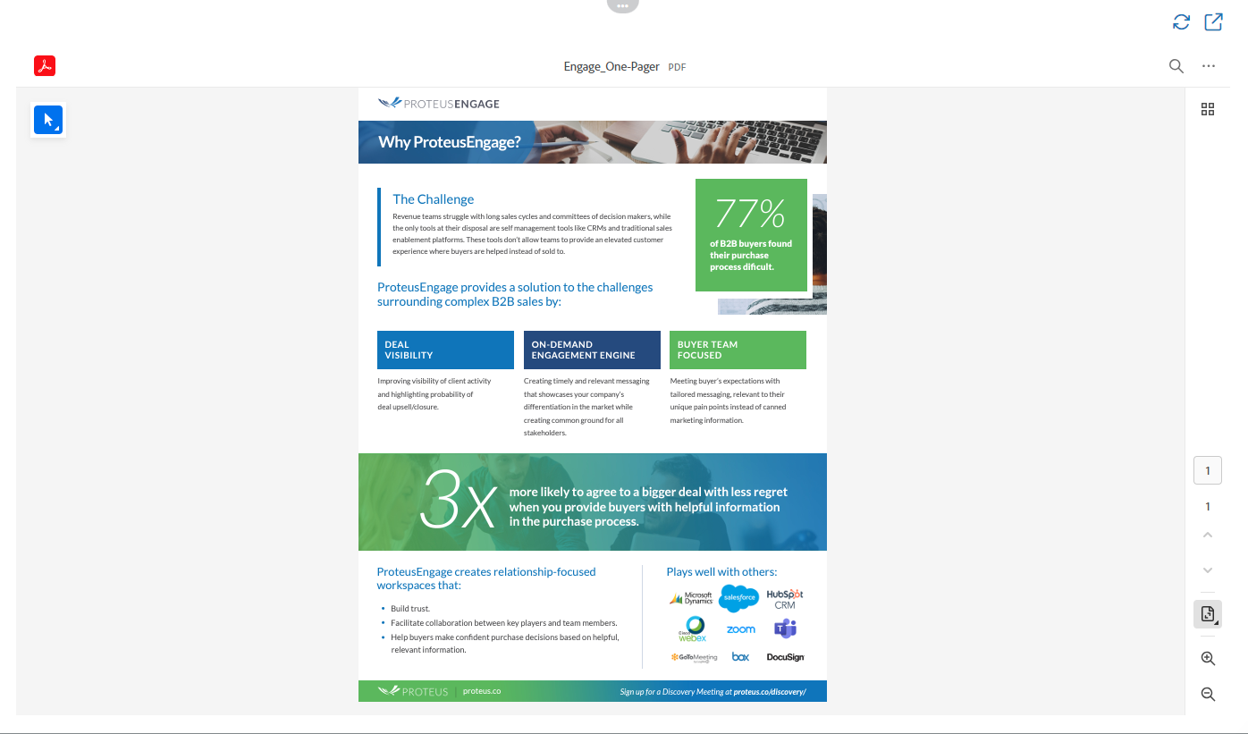
This component is used to display a large horizontal image with a text banner across the image.
It’s most often used as a graphically appealing section heading to a module. When considering an image for this component, it is important to take the size suggestion into account. For example the image below is much wider than it is longer, making it perfect for this component. A square image that is equal width and length would not work well in this component type.
NOTE: All components with the option for images display a suggested image size inside the editor of the component.

Bio
This component is used to display the details of a team member. It showcases the person’s name, title, email, phone number, social media links, photo, and summary of their job expertise/responsibilities. This component is used inside each user’s profile bio. You can also use this to showcase a team member of the week or identify the point of contact for a workspace.

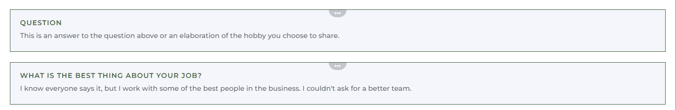
Blurb
This component is a simple title heading and text that is contained in a highlighted and outlined box. This is designed to stand out and help break up the other sections of a module. We use this component inside each user’s profile bio to showcase their hobbies or interesting facts. But this can also be used to highlight company facts, case studies, or any short text pieces you’d like to display on a workspace module.
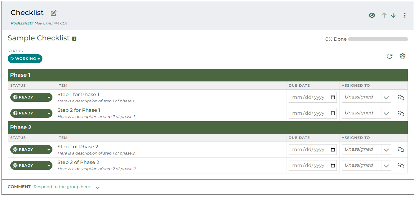
Checklist
This component allows for reps and contacts to create a list of items to complete. Checklist items can be assigned to a specific person on the workspace and given an approximate due date to help increase visibility and accountability for different goals such as onboarding, training, and quarterly goals. Checklist items can also contain related modules, tasks, and automated reminders.
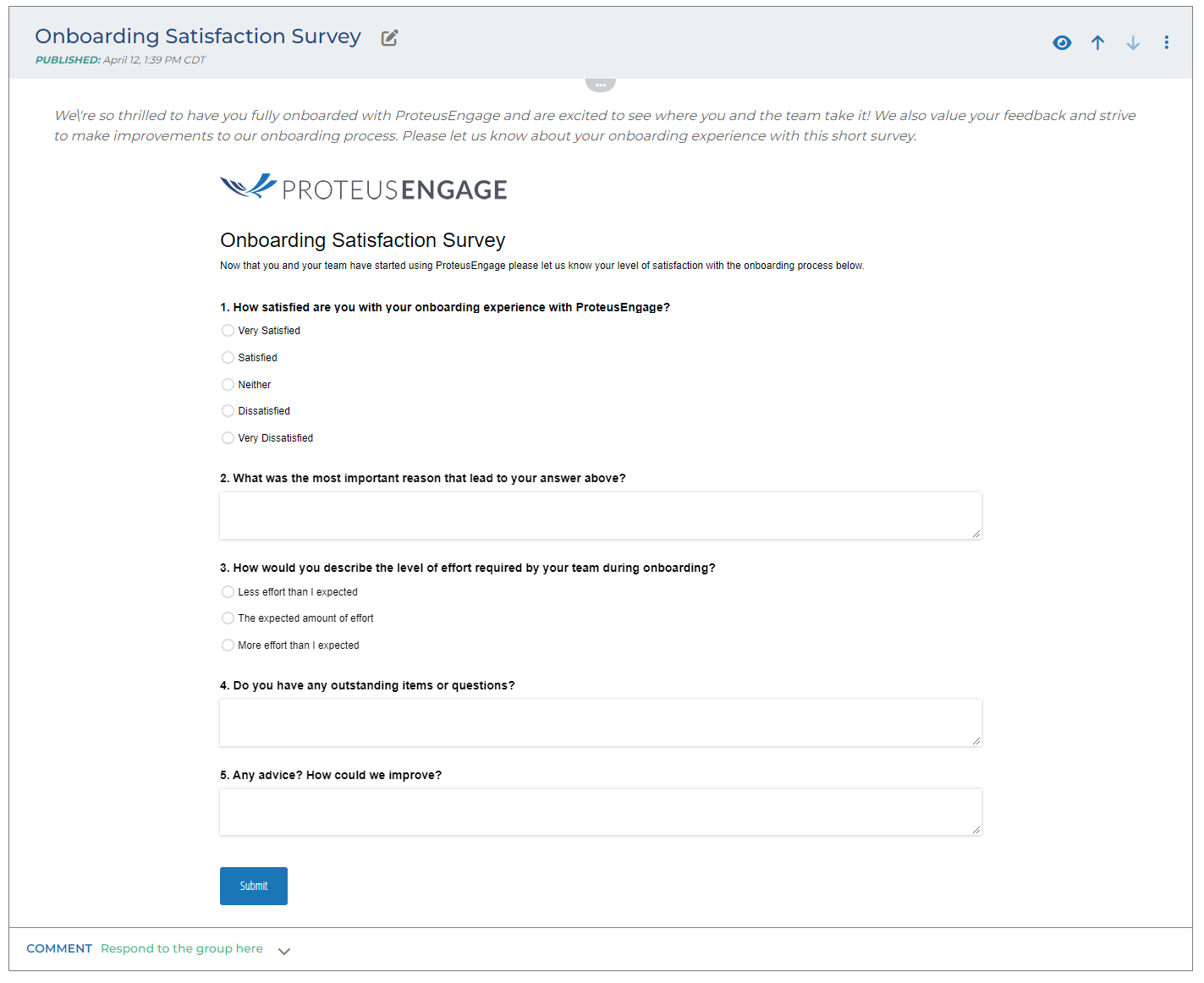
External Form Integration
This is a component we use to embed a third party tool called Cognito Forms. This third party system allows people to build different kinds of forms. These forms can be imbedded into a module via an embed code and filled out by anyone with access to the workspace.
We can also base some automations on the completion of these forms. For example, if someone fills out a registration form, additional content can be shared with the submitter through the workspace automatically. A subscription to Cognito Forms is required in order to utilize this component.
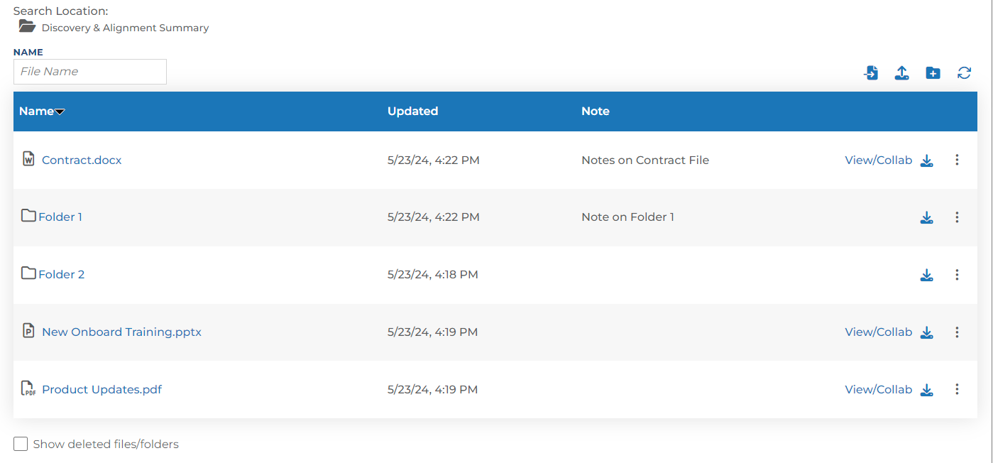
File Sharing
This component works like the file system on your computer. Users can upload and download files while organizing them into folders. Users can also collaborate on files straight from the workspace. This component works similarly to OneDrive or Google Drive where users can add make edits, submit comments, or add suggestions.
This component contains several permission levels so reps can limit access or manipulation of certain files as well. For example, you may only want your internal team to edit contract related documents. So contacts only have permission to view and download.
Inline File Sharing
This component works similar to the file sharing component above. Only this component is made to showcase only one file. The full view of this file is displayed directly on the workspace. Users still have the ability to edit, submit comments, or add suggestions. But these changes are automatically reflected in the view of the document.
This component has settings that allow for the file to be viewed in different modes depending on the type and length of file. Plus, the same permission levels available on the file sharing component (above) are also available on this inline file sharing component.
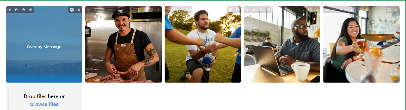
Gallery
This component is built to showcase a group of photos. This module allows you to group all the photos together in a collage and incorporate photo titles, captions, and messages to each of the images. The gallery is also collaborative so both your internal team members and contacts on a workspace can add, reorder, and caption photos on this component when used on a workspace.
This component is used inside each user’s profile bio. Galleries are managed by your content manager. This component allows those galleries to be pulled into a module.
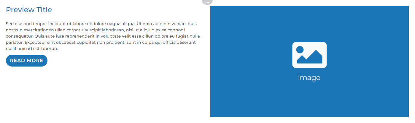
Link
This component allows users to link out to a public URL while also showcasing an image and text to accompany the link.
This component also comes with a feature that allows you to pull the image and text from the public URL you plan on linking out to. For example, if you want to share a blog post from your website, the module will pull in the image and initial paragraph text that you have already built into the article. But you can always populate the accompanying text and image manually if you choose.
Users can also choose the placement of the image in relation to the text as well as the text within the button.
Link Component
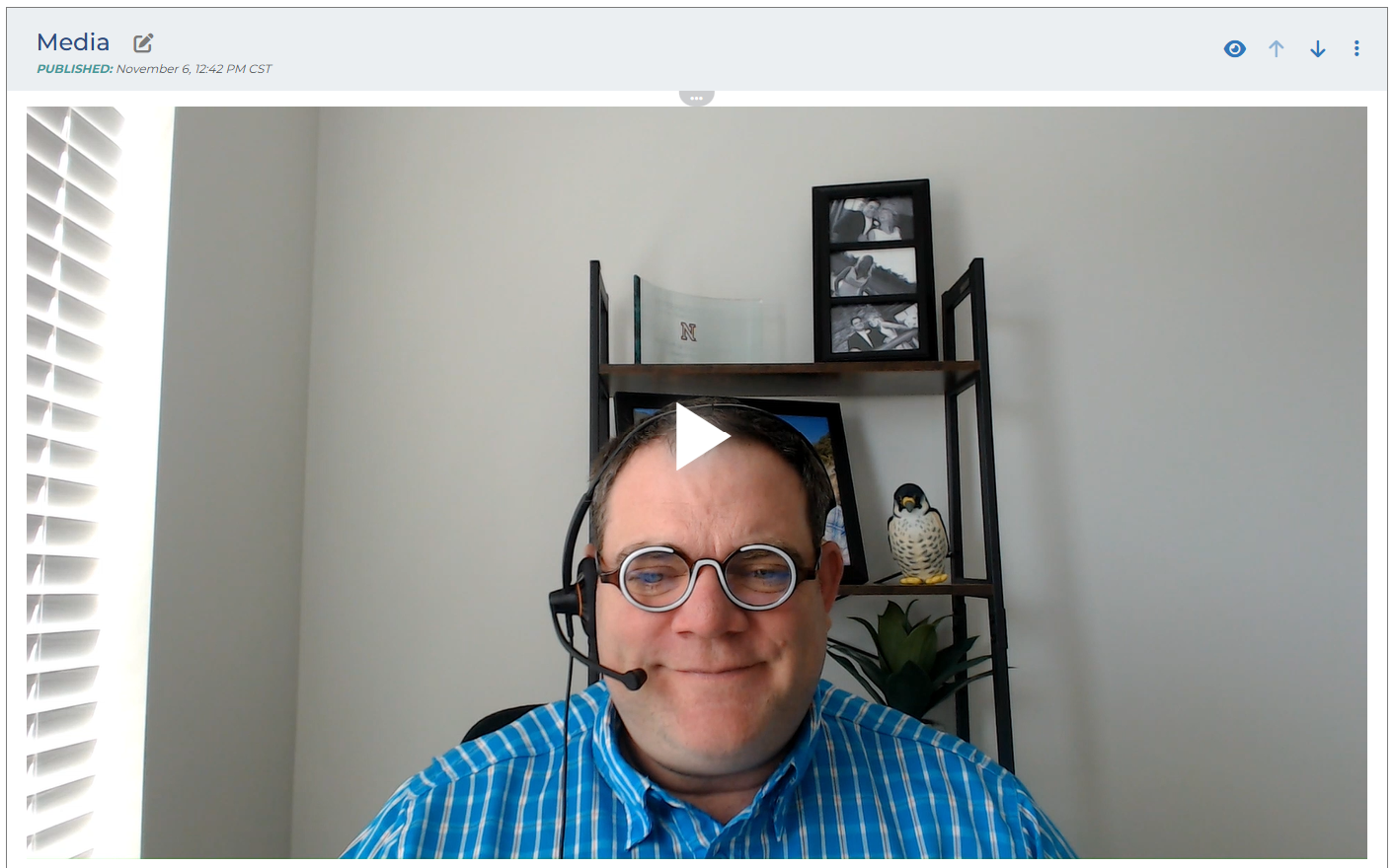
Media
This component allows you to display an uploaded image, video file, embed a Youtube video, or embed a Vimeo video on a workspace.
Users can either populate a video file or an embed code from Youtube or Vimeo. Users can play and download the video straight from the workspace.
This component can take up a large amount of space (like the screenshot below) or a smaller amount of space (like the image above).
Prose
This component is a basic text box that you can use to accompany other components. Perhaps one of your components needs to be explained so both internal teams and external contacts know how to interact with it. This component can be place on top, bottom, or beside one of your other components that need more context.
This component works similar to Word in which the user can manipulate the color, size, and formatting of the text.
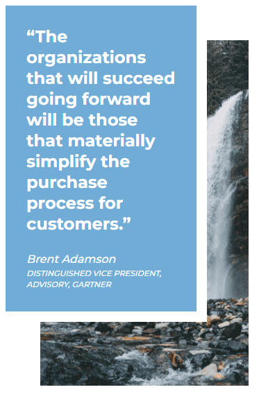
Quote
This component is used to showcase a quote. This quote can be from a satisfied client, a founder of the company, or something inspiring. Users enter the text of the quote, the author’s name, and the title of the author. The quote is set in front of an image background that you can populate. Otherwise, the background will be one of your company’s branding colors. This component is used inside each user’s profile bio.
Custom Content Selector/Custom Content Container/Custom Content Container with Inline Edit
These should only be used with the help of the support team. These are only used when our other component options would not work for your content use case.
NOTE: Components can take up as much space inside a module as they are allocated. The layout of a module determines spaces for different components. Content managers can choose the layout while building modules. Any additional questions about components or their layouts? Reach out to Engage support.