
Gallery
You’ve learned a little bit about the Gallery component from: All About Modules. This article will show you where and how to manage galleries.
You can add a gallery component to any module. The component is tied to a gallery template. These templates are managed in the content management area of the platform. Only users with content manager permission can access this area of the platform.
Inside Gallery management, you’ll find a list of all active gallery templates. You can choose to edit a gallery or create a new gallery from this management area. There are search filters at the top of the page to help you find and edit an existing gallery.
Search Filters
If you select Module Library from the gallery type drop-down, you’ll be seeing all unique gallery templates. These templates can be added to any module. When in this view, you can use them to search for the name of an existing gallery.
Editing any of these templates will affect any module on any workspace currently using this template
If you select Workspace from the gallery type drop-down, you’ll be seeing all instances where a module containing a gallery exists throughout your platform. For example, if one of you galleries exist in several workspaces, each workspace will represent a record.
As a result, you could edit the gallery in only one workspace instead of editing the gallery on every workspace where it exists. When in this view, you can use the Workspace filter to search for the name of a workspace that contains a gallery.
Gallery Editor
Add File(s)
This option is for showcasing an image as the primary content. You can upload multiple photos at once. Once you’ve selected the photos you want from your computer, you’ll see an upload status at the bottom of the section. When the upload is complete, you can click the “ok” button.
Now your images display inside the items listing. You’ll notice that there are several column headings in the items table: Item, Title, Caption, Overlay. These can be edited by clicking the edit button on each photo.
Item: This is the name of your file from your computer upload. This is an internal name and will not be displayed inside the gallery. This can only be changed by renaming the file on your computer and then reuploading the image.
Title: This is the public title that will appear at the top of the photo when viewed by a user. This is often used to summarize what the image is. If this is not populated, the Item name will be added in its place.
Caption: This is text that will display below the photo when viewed by a user. This is often used to describe the details of the image in more words than a title would.
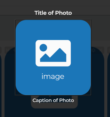
Overlay: This is the text that will display when a user hovers over the image.
Title, Caption, and Overlay fields are all optional. You can always leave them blank. If you want to make sure others don’t use them either, you can always disable these fields using the Item Property settings.
You can use the up and down arrow buttons to rearrange the order in which the photos will appear inside your gallery. If there is a photo you no longer want inside this gallery, you can use the delete button.
There is also the option to add a thumbnail image to accompany your image. You can utilize this if you image is very large and contains many elements. The thumbnail image will represent the first part of the image they see inside the gallery. Then when they click on the thumbnail, the original image will appear.
We help generate thumbnail options for you based on the subject and size of your photo. We crop the photo to showcase the main subject of the image. If you don’t like the thumbnails we suggest, you can always use your own image cropper to create your own thumbnail and upload it from your computer.
Adding Files to Gallery
Add Link
This option is for showcasing a link. The link will be represented by a thumbnail image that is clickable and will direct the user to the URL you choose. This would be helpful for showcasing product or service photos that require more detail in the form of your website or landing page.
Because users are redirected to the link when clicking the image, users are only allowed to add an optional overlay message.
Adding Links to Gallery
Configuration
Depending on the images you are showcasing, you might want to display them differently depending on the dimensions.
When inside a gallery editor there is a configure button at the top. Clicking this button will open the display settings for your images inside this gallery.
Configure a Gallery
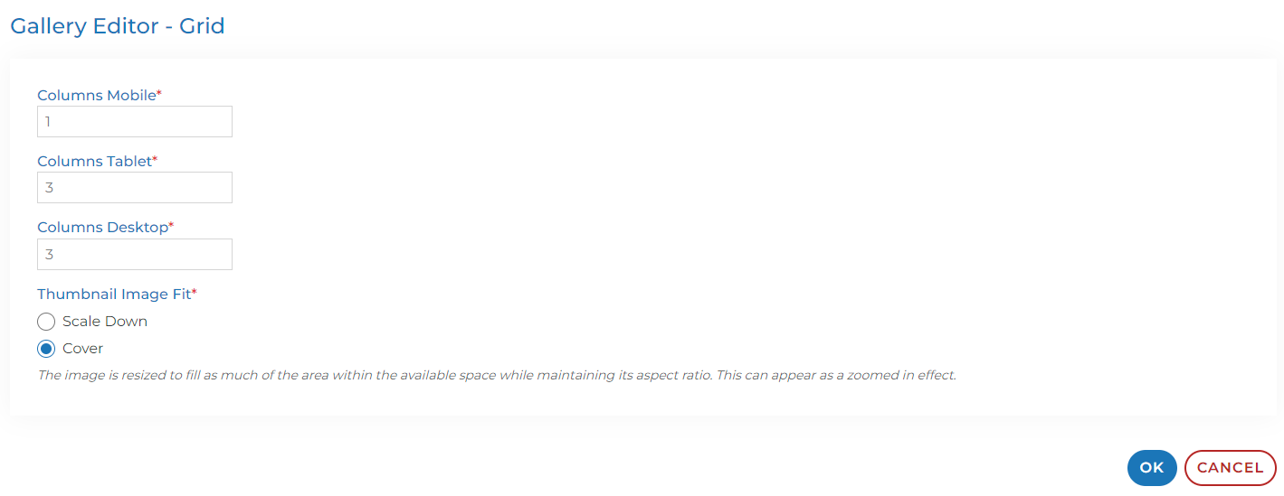
The first three fields ask you to input a number. This number is the amount of images per row inside your gallery.
Columns Mobile: This is what your gallery will look like to a user viewing the workspace using their cellular device. We recommend 1 or 2 in this field as we want to showcase as much of your image as possible on a small screen.
Columns Tablet: This is what your gallery will look like to a user viewing the workspace using a tablet. The screen is slightly bigger, but not as big as a computer screen. As a result, we recommend 3.
Columns Desktop: This is what your gallery will look like to a user viewing the workspace using a desktop computer. This is where you can really choose whatever number you want. Keep in mind that the higher the number, the smaller your images will appear inside the gallery.
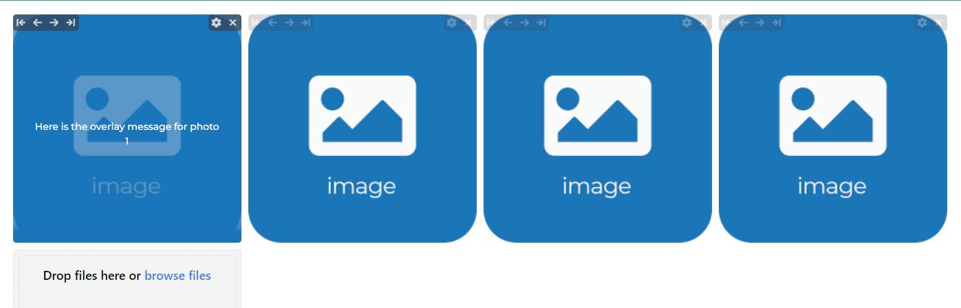
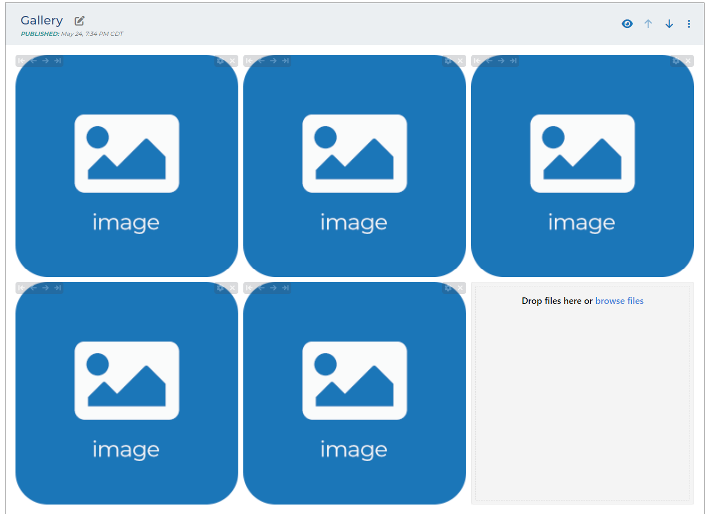
For example, if I have 5 images and I choose 3 columns, the gallery module will look like this:
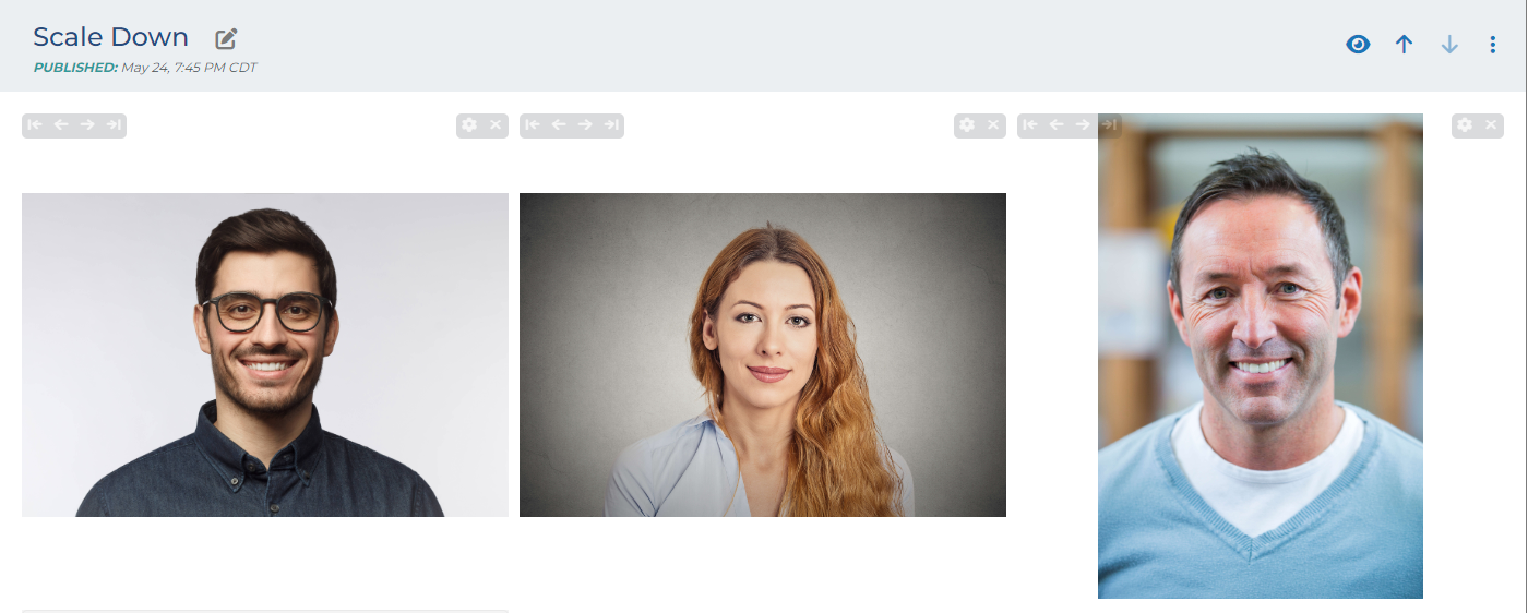
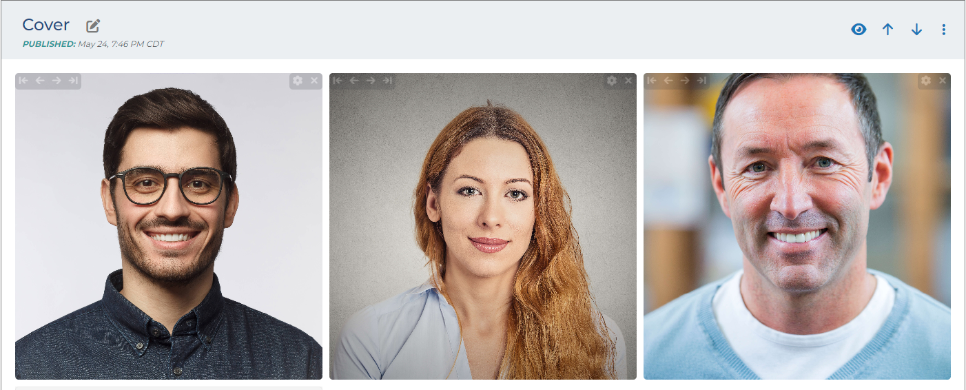
Thumbnail Image Fit: This field has two options. Scale Down or Cover.
Scale Down: If the image fits within the available space, then nothing is done. If the image does not fit within the available space, the image is resized to fit within the available space while maintaining the aspect ratio of the image.
Cover: The image is resized to fill as much of the area within the available space while maintaining its aspect ratio. This can appear as a zoomed in effect.
Add Gallery to a Module
Now that you have built and configured your gallery, it’s time to add this gallery to a module.
Each Engage company has a gallery module built in by default. If you need to add a gallery component to an existing module or create a new module using a gallery component, please review this article:
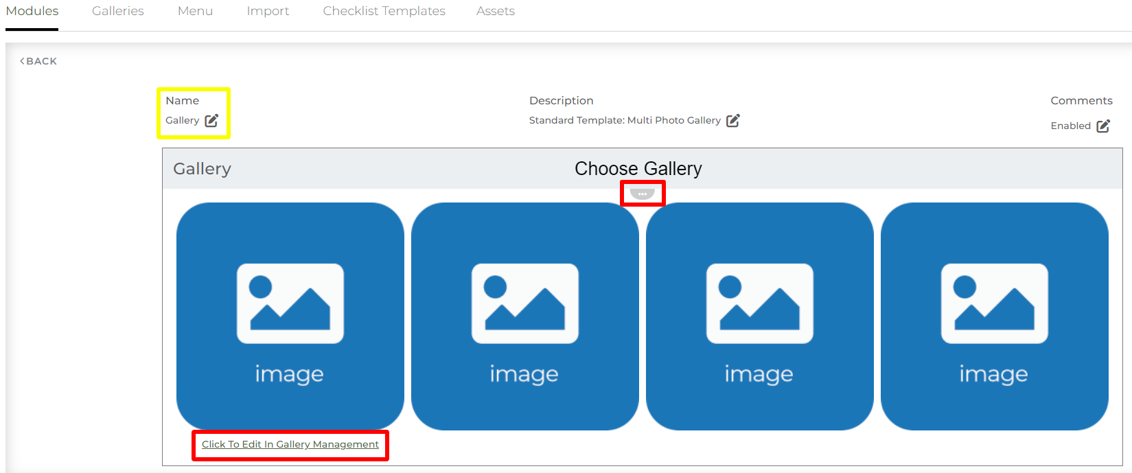
Inside the module management area, you’ll want to find the module that contains a gallery component.
Click the ellipse icon  at the top of the module. This will open a dialogue box where you can select any gallery from the drop-down of options. Once you select a gallery and save, you’ll see the gallery appear inside module management. This is how the gallery will display when the module is added to a workspace.
You can also decide on the sharing permissions of the gallery. You can open the gallery up for collaboration or you can keep the gallery as a display only piece of content.
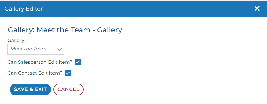
Can Account Rep Edit Item?: When this check box is checked, reps are able to edit existing images and add new images to the gallery. In edit view of a workspace, there are buttons that will display on each image where reps can edit. A “drop files here or browse files” option will appear at the end of the gallery where reps can add new photos.
Can Contact Edit Item?: When this check box is checked, contacts are able to edit existing images and add new images to the gallery. In live view of a workspace, there are buttons that will display on each image where contacts can edit. A “drop files here or browse files” option will appear at the end of the gallery where contacts can add new photos.
Any changes the contacts make do not affect the template. They only affect that specific module.
When the box is not checked, the images are only visible and clickable. The edit buttons and the browse files options disappear.